Composition Tricks that Double for Styling
Put It on a Pedestal
Below are images we looked at inside the Spiral Staircase lesson that include a circular mirror I like to use often when styling images, because the circular shape contains my image and draws attention to my subject:
… and here are some more images from other photographers that demonstrate this principle and compositional trick (remember that fabric/textiles, trays, platters, cutting boards, saucers, and more can be used as “pedestals”):
Dynamic Symmetry
Below are a few more images from the ‘gram that demonstrate Dynamic Symmetry. Notice how simplistic each of the images is; that none of them contains a lot of extra noise, and that the stylization actually comes from the symmetry more than anything else, if there is anything else, in the image:
The above image is a composite of two images taken from the same position, once at night and once during daylight.
Motion / Gestalt
To learn more about the Gestalt Principles as they apply to art & design, but potentially also photography, read this article. You can also search up “Gestalt Design” on YouTube to find some fascinating videos!
Here are some images that illustrate the Gestalt Principles covered in the video lesson above. In these images, items that are “like” are grouped together in the brain; and items that are mostly “like” but have a minor difference are easy to spot, a styling technique that is easy and doesn’t require any additional props. Also note the movement in images where like images don’t follow any particular order.
Negative Space
One of the styling principles not covered in the video lesson is the use of negative space.
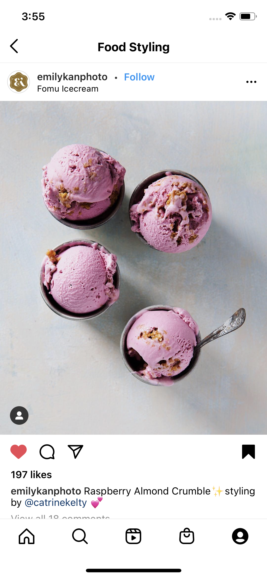
Negative space is space where intentionally, nothing has been placed. When there’s less to look at, the eye gravitates to the single item, or small group of items, that does fall into the frame. It’s a minimalist styling technique that can be very powerful, though it can be difficult to make it look intentional; the single item or small group of items must tell a powerful story on their own without extra context. See the images below as samples of this styling method.
In Conclusion
Everything we’ve covered in Photo Styling Basics builds on itself. The more firmly in your routine you can establish all the steps outlined in lesson one, the stronger you’ll be for lessons 4-9; the better you get at the techniques we covered in lessons 2-3, the more you’ll have to work with when styling products, food, and people.
I highly recommend starting your own photo collections, as I have on Facebook, Pinterest, and Instagram. Organize them into boards or collections called things like, “Business Photo Ideas,” “Just Caught My Eye,” “Lighting,” “Color,” and other categories that are specific to your goals, because this will make photos easier for you to find later, and because if you’re stuck for inspiration, you can ask, “What could I do with color for this shoot?” or, “How could I photograph this in unusual light?” and you’ll have plenty of inspiration to draw from.
To get you started, I have several Pinterest boards you might find helpful, including:
Super Awesome Instagram Accounts (to follow for inspiration)
Photo Ideas (general)
… and others that may be helpful, as well!
You can also learn more about how the Golden Ratio is used in photography by watching this video:
Hello there! I’m your hostess, Alexis.


